Publishing:HD Bulletin 1: Difference between revisions
No edit summary |
No edit summary Tag: Manual revert |
||
| (24 intermediate revisions by 2 users not shown) | |||
| Line 1: | Line 1: | ||
{{:Bulletin_1_Cover}} | |||
{{:Bulletin_1_Introduction}} | |||
{{:Age_of_dust}} | |||
{{:Visual_essay}} | |||
{{:Earth_battery}} | |||
{{ | {{:A_little_internet}} | ||
{{:Creative_Crowd}} | {{:Creative_Crowd}} | ||
{{: | |||
{{:Bulletin_1_Note on Design}} | |||
{{:Bulletin_1_Colophon}} | {{:Bulletin_1_Colophon}} | ||
{{:Bulletin_1_Blurb}} | |||
Latest revision as of 18:27, 14 July 2023
H&D Bulletin #1
   #####    ##        ##### ##
  ######  /  #### /  /#####  /##
 /#   /  /   ####/ //    /  / ###
/    /  /    # #  /     /  /   ###
    /  /     #         /  /     ###
   ## ##     #        ## ##      ##
   ## ##     #        ## ##      ##
   ## ########        ## ##      ##
   ## ##     #        ## ##      ##
   ## ##     ##       ## ##      ##
   #  ##     ##       #  ##      ##
    /       ##         /       /
  /##/        ##    /###/       /
 /  #####      ##  /   ########/
/     ##          /       ####
#                 #
 ##
 __          __ __       __   __
|  |--.--.--|  |  .-----|  |_|__.-----.
|  _  |  |  |  |  |  -__|   _|  |     |
|_____|_____|__|__|_____|____|__|__|__|

                               _,  ,
                              |.| /|
                              |_| .|.
             _________
           .`.        `.
          /   \ .======.\
          |   | |______||
          |   |   _____ |
          |   |  /    / |
          |   | /____/  |
          | _ |         |
          |/ \|.-"```"-.|
          `` |||      |||
             `"`      `"
  _______ _______   __________ _______
|   _   |   _   | /  |       |   _   |
|.  |   |___|   ,' ,'|___|   |___|   |
|.  |   |  /   /__/   /  ___/ _(__   |
|:  1   | |   |      |:  1  \|:  1   |
|::.. . | |   |      |::.. . |::.. . |
`-------' `---'      `-------`-------'
Setting the scene
This first edition of the H&D Bulletin evolved in the period leading up to the H&D Summer Camp “Hopepunk: Reknitting Collective Infrastructures,” taking place from 17th to 27th of July 2023 at the campsite Het Wilde Weg in Sint-Oedenode, The Netherlands. H&D has the opportunity to take over the entire campsite for the duration of the Summer Camp. We are excited to take good care of the place while its owners are taking a break.
“Hopepunk: Reknitting Collective Infrastructures” responds to the widespread feeling of anxiety, uncertainty and dread caused by geopolitical tensions, climate crisis and asymmetric distribution of wealth, power, and everyday resources, as accelerated by turbo-capitalist innovation and planetary-scale computing. The campsite will become our test site for reimagining and reknitting arbitrary boundaries between work, play, leisure, maintenance and care, that is, for managing “the meanwhile within damaged life’s perdurance.”[1]
Along with thirty co-habitants we embark on an adventure of learning, making and living together, and work towards holistic and intersectional ways of practicing sustainability and regeneration (technically, socially, ecologically, economically, culturally).
“It takes a village…”
Hope, to us, is political and rooted in generosity and reciprocity. It means collectively imagining and putting into practice economies of care – humble forms of exchange, that take others into account, that understand regeneration as non-negotiable, that resist greed and artificial scarcity, that refuse gate-keeping of resources, extraction and privatization.
Setting up a temporary H&D village is our attempt to imagine what is not yet there, or to put it in the words of physicist and feminist scholar Karen Barad, it is a Gedankenexperiment. Such thought experiments are imaginative, reflective, concrete, and consequential. According to Barad, 'Gedankenexperiments’ are pedagogical devices. They are non-material eventualities, however, they do matter in material ways.[2]
We will be experimenting with solar technologies, solar-cooking and food preservation, community forming through life action role play, in situ coding, gymnastics, repurposing electronics and (food) waste, tracing water histories of the past and the current local water, building electric circuits of organic materials, and more.
Refusal
At the campsite, we enter an immersive experiment of living and working together, self-organize experience-based learning and tool-sharing as a political practice and mode of refusal. On the one hand, this refusal is about resisting linearity, efficiency, and a progress-based understanding of earthly co-existence. On the other hand, it is also about resisting despair. By refusing to accept the status quo we refer to the “punk” in Hopepunk (and akin genres such as Solar-, Cyber-, Cypher, and Steampunk). That is, hope does not operate at the expense of active resistance. Being hopeful is about taking the liberty to orient towards something that takes place in the future, like the warm illumination of a horizon charged with possibility, it pulls us into the future.
Solarpolitics
In her book Solar Politics Oxana Timofeeva describes the sun as a comrade in kind who gives without asking in return. She explores the question: what would a socio-political economy, informed and fuelled by the sun, look like?
The sun, as the biggest source of energy within our solar system, provides us with an excess of free energy that cannot be exhausted or contained. It is a common. It cannot be privatized. Could an economy solely fuelled by the sun be one defined by gift, solidarity and altruism? Could a shift from a capitalist to such a solar (powered) economy be a Copernican transformation? Similar to how the discovery of the sun as the core of our universe, changed the perception of us earthly inhabitants and ultimately our relationship with our environment to be less human-centric, could a sun-based economy equally recalibrate our ways of living together with the earth?
The sun in Solarpunk is often depicted as “a super-abundant resource that can (in theory) provide for all. Solar in this sense is equated with optimism, but also with a political ambition to envision and build a harmonious future powered by clean energy”.[3] The genre of Solarpunk has acted as an orientation guide for H&D’s activities in the past two years. The science fiction literary genre and art movement envisions techno-futures in which humanity succeeds in solving major contemporary problems with the help of technology. Yet, as Georgia Kareola describes in Solarpunk & Web3, the specifics of these imaginaries “vary depending on the politics of the dreamer". After all, the “sunlight does not fall on everyone equally.”[4] In a similar sense, technology is not accessible to everyone equally.
Hopeful pragmatism
The intergenerational Solarpunk workshops[5] we developed in 2022 showed us that the optimistic outlook embodied by the genre provides interesting tangents and tensions when combined with hands-on practical approaches. Can oppressive regimes, such as capitalism, authoritarianism, sexism, racism, and ableism be undone by solar power? It seems unlikely. Perhaps the core of punk futures lies in the DIY and DIT mentality – our capacity for generating pragmatic hopefulness.
We’d hope such pragmatic hopefulness leads us to overcome the dystopias as well as the nostalgia of Cyber / Steam / Cypherpunk without creating a totalizing image of a harmonious utopian society (as is sometimes the case in the Solarpunk genre). What should not be forgotten are the injustices embedded in (solar) technology and the ways that climate change affects people “differently, unevenly, and disproportionately.” [6]
In a time of simultaneous and exponential increase of digital dependency and environmental exhaustion, we, as a collective of hackers, designers, artists, and educators who are intertwined with and interested in technology, find it important to answer the following question(s):
How can we build, repair, maintain and manage our technologies to allow for the continuous operation of global communication and information sharing while prevailing forms of digital interdependencies are injurious to human and non-human life? How do we organise ourselves to this end?
These questions, and their possible answers, are at the heart of the political and aesthetic movements such as Solarpunk, Hopepunk and also more recently Permacomputing[7], to which Timofeeva’s text seems intimately related. All describe speculative scenarios about the full transition to renewable energies, which take on board a movement towards sustainability in inter-human interactions as well:
“Solarpunk runs starkly in opposition to the political and economic forces of late-stage capitalism by demanding a non-hierarchical, diverse, decentralised yet integrated world. A world with worker co-operatives, tool shares, maker spaces, and common-pool resources.” (Andrewism, 2022)
The contributions in this edition attempt to articulate, visualize and draw into the future a hope-based society through community-based tool-building, and use active imagination of desireable techno-futures.
References:
- "Why this gives me hope for the future," @Andrewism, https://www.youtube.com/watch?v=u3aauiR9M88 (2022).
- O. Timofeeva, "Solar politics," Medford, MA: Polity Press (2022).
- “‘This Shining Confluence of Magic and Technology’: Solarpunk, Energy Imaginaries, and the Infrastructures of Solarity”, R. Williams, Open Library of Humanities 5(1), 60. (2019).
- “What might degrowth computing look like?” Neil, https://criticaledtech.com/2022/04/08/what-might-degrowth-computing-look-like/ (2022).
- I. Stengers, In Catastrophic Times: Resisting the Coming Barbarism, (2015). Publisher: Chicago, IL: Open Humanities Press
- “Solarpunk & Web3,” Georgia Kareola https://zine.zora.co/solarpunk-web3-kareola
- A. M. Brown and W. Imarisha, "Octavia’s Brood, 'The Only Lasting Truth'," pp.184 of pdf and 'Outro' p.197.
- K. Loach, "Land of Freedom" (1995)
- R. Hardy, "Wicker Man" (1973)
- U. K. Le Guin, “The Dispossessed” (1974)
- U. K. Le Guin, “Left hand of darkness” (1969)
- “Solarpunk & the Pedagogical Value of Utopia" http://www.susted.com/wordpress/content/solarpunk-the-pedagogical-value-of-utopia_2020_05/
- L. Berlant, “The commons: Infrastructures for troubling times,” Environment and Planning D: Society and Space 34, no. 3 (2016): 393–419.
- K. Barad, "Meeting the Universe Halfway: Quantum Physics and the Entanglement of Matter and Meaning." Durham and London: Duke University Press. (2007).
- Permacomputing: https://wiki.xxiivv.com/site/permacomputing.html
Looking forward...
゚・:*。 Age of Dust ~。*:・゚
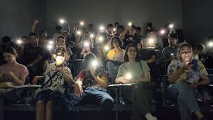
Generations after the eruption of the Volcano, three communities meet around the discovery of a mysterious mineral: the Dust. As an essential source of energy, sacred healing powers, and geological warning, what messages and hopes does the Dust carry? When different belief systems meet, how to find a common ground? How will their encounter shape the world of tomorrow? The Age of Dust is a transformative journey, in which participants play out social and somatic dynamics to resist conventional narrative tropes and think beyond anthropocentrism while experimenting with collaborative storytelling.
The Setting
Generations ago, an extraordinary eruption of the Volcano destroyed most of the world's life. The Creatures of the Crater survived. They are the offspring of volcanologists, native beings of the Volcano who were able to predict the event by combining their scientific and spiritual knowledge and therefore found refuge in time. They tried to warn others but were ignored. Every month during the new moon, when the sky is the darkest, the symbiotic community comes together for a ritual to commemorate all the lives taken by the lava and announce their predictions for the new cycle. During the ritual, they enter into communication with the Magma Spirits that inhabit and constitute the Volcano, which can sometimes confirm their predictions. The Magma Spirits are one and multiple, witnesses of deeeeeeep time, they hold a wonderful power of creation and destruction.
Further away from the Volcano, another community survived: the Sourcers, survivalist techno witches that had hidden from the doomsday, underground in scattered burrows. It was said that Magma Spirits at night, during their sleep, had whispered in the ears of some Sourcers that the eruption was coming. All Sourcers were connected to each other through a techno-magical network that allows them to share information, archive history, and organize their survival, although they are not physically together.
After the eruption, the landscape was dark and hostile, but it soon became the grounds for luscious bushes, strong trees that blossomed flowers, and fruits. The Creatures of the Crater reintroduced native species from seeds and cuttings they had preserved. Life started anew around the resting Volcano, but started growing hybrid, patchworked from different materials, the ground, trees, plants, stones, would sprout minerals, metals, sometimes gems...
Popping out of the peaceful black ground, some mysterious lava stones were found to be emitting a strange glow in the moonlight. Raising curiosity and wonder, the shining stones would sporadically puff up a red powder when the moon was at its fullest. The powder was called "the Dust" and it would magically disappear into the air with a sigh of relief, creating a soothing echo around the volcano. Among the Creatures of the Crater, some saw the blasts as messages, omens, or warnings from the underground, and were dedicated to understanding them. They developed rituals around them.
On their side of the world, Sourcers had also discovered the glowing stones and their Dust, but their presence was quite rare around the shelters. They found a way to capture the Dust before its disappearance and found it to be a rare and precious resource they could rely on for their survival. It was an alternative to the solar power that was becoming harder to source. They needed the Dust to survive and would need to find more of it.
Lately, the Dust phenomenon has changed behavior. Bursting more than before, breaking the cycle of the moon, the stones have been springing out, the Dust does not disappear into a shimmery sigh anymore, and little piles of Dust remain on the ground, leaving everyone wondering. It was as if the geological process was broken. The balance has been disturbed.
A group of Sourcers got on its way to the volcano for the first time ever, breaking the perimeter of safety they had been living by for decades.
The Sourcers and the Creatures of the Crater are unaware of each other's existence, but the Magma Spirits can appear to both of them.
The three communities are about to meet and bond around the mysterious Dust and find ways to organize their lives with a resource essential to both for different reasons. Only the Maga Spirits know the true nature of the Dust, and they can only hope everyone will come together to restore balance...
Rules & Disclaimers
Gender: Characters can be human or non-human. You can decide and share what pronouns you would like to go by. By default, we will use they/them for anyone, whether human or not, unless specified otherwise by a player.
Violence/tropes: This shared moment is thought of as an experience of wishful storytelling. The story can take many forms, and we make it together. Avoid bringing violence of any kind into the shared story, and try to resist falling into narrative tropes and archetypes. This is not the story of a hero's journey or a narrative about good vs. bad. Let's instead play with the understanding that everyone is intrinsically good and that everyone fights their tendencies to reproduce violent normative patriarchal systems. Let's practice dismantling!
It's important that everyone feels ownership over their character and the story.
The basis of the story will be set out, and you will be guided through it. But you are welcome and encouraged to make it yours, add to it, and invent new parts … You are invited to make this world, and expand it together!
It's fine that things happen in parallel, you can have parallel discussions, and regroup when you need to take decisions as a group.
Let your mind go to unexpected places. You are not expected to do anything. The play adapts to where you are taking the story.
Be mindful of the space you take and leave room for others to express themselves too. In the game we are trying to rehearse mindful and caring ways of behaving. Let's try this in everything we do during this time and hopefully afterward as well!
More than our story making perfect sense, it is important that we all have a great experience!
Triggering spots > define altogether
3 types of characters (presented in printed character sheets):
Creatures of the Crater:
- Community > symbiotic beings - living with and around the Volcano - humans/non-humans evolution of volcanologists and native lives
- Time perception > follow the moon cycles
- Power > measure things and see omens in everything: they make predictions
- Behavior > communicate with magma spirits at specific times
- Fate > discover what Dust is
- Action > can make 2 predictions of their choice (as a group) that must become true in the story
Sourcers/Fossorials:
- Community > solar punk techno witches survivalists - humans/non-humans - living underground
- Time perception > blurred
- Power > connected with each other through a techno-magical network
- Behavior > superstitious > DIY > commoning knowledge
- Fate > survive and maintain their network
- Action > can use 2 techno-magical solutions throughout the game that can solve anything (as a group)
Magma Spirits:
- Community > spirits living in the Volcano - one and multiple - non-physical
- Time perception > deep - geological
- Power > channelling/ apparition
- Behavior > deliver cryptic messages to creatures of crater, only interact at specific times
- Fate > help physical beings to be liberated
- Action > reveal their secret throughout the game (to be discussed with GM)
The Age of Dust is a world-building workshop and live-action role-play first imagined in the context of Lava Lines, a group exhibition and public program curated by Leila Arenou and Naïmé Perrette at Biblioteka in London, UK. The project further evolves in the context of Hackers & Designers 2023 program "Hopepunk: Reknitting Collective Infrastructures."
The Age of Dust will be activated during the H&D Summer Camp 2023. The next iteration will take place at Constant Association of Art and Media in Brussels on the 15, 16, and 17th of September 2023. The role-playing part is reworked together with Susan Ploetz. The technical aspects of the play are developed in close collaboration with H&D (Loes Bogers, Heerko van der Kooij) and Emma Pareschi.
https://constantvzw.org/site/Open-call-L-age-de-la-poussiere.html
https://hackersanddesigners.nl/p/The_Age_of_Dust
Visual Essay by Lukas Engelhardt and Sheona Turnbull
...looking back:
✧˖°. Mud batteries ⋆ ˚。⋆୨୧˚
How-to make batteries from soil
For the 8th edition of the H&D Summer Academy "Connecting Otherwise" H&D invited four initiatives (DDDUG, Hackitects, MELT, NEWS) to develop a workshop program together for four different interconnected locations: Amsterdam, Aotearoa (formerly known as New Zealand), Berlin (+ online) and Seoul. In Amsterdam, H&D was accompanied by the Hackitects (Michel Barchini, Mary Farwy). Hackitects hosted a workshop, during which participants were invited to explore strategies to radically reduce the energy use associated with communication technologies such as the Internet. More specifically we worked with DIY biotechnologies, that utilize bacteria found in local iron-rich soil are harnessed to generate and store energy.
Collecting mud for the battery
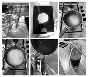
Look for reddish brown soil (rich in iron) near riverbeds and swamps, areas where water has a reddish color. Preferably collect deep samples not from the surface.
About 1 liter makes 2 batteries. Ideally, you get it a few days before the workshop, but the soil should stay good for up to two weeks. It is always good to collect more mud than you calculate, in case some spills during preparations.
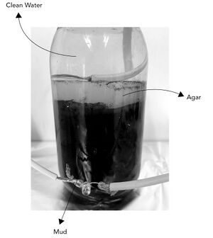
Make sure you take mud as well as some water (see image below).
Tools
- Pot and stove to cook the agar mixture
- Multimeter
- Clippers and wire stripper
- Breadboard
- Kitchen scale
- Liquids measuring cup
- Tape (or anything to mark different wires)
Materials
- Mud
- Containers with wide openings on top (ex: glass jar or plastic container - around 1L)
- Electric wires (Copper wires 30 cm - 2 wires are needed per battery)
- Stainless steel grids to be cut in rectangles. Size: around 8 x 8 cm, but can change according to the size and shape of your container. Aluminium nets are good to use, but they are less conductive. You can also use kitchen strainer mesh. You can also experiment with the size of the net, for example: making it like a strip 8 x 20, to have more surface area. In this case, you can roll it without making the surfaces touch.
- Epoxy glue
- Small brush to spread the glue
- Active coal
- Agar (10g is needed per 1L battery)
- Salt substances (any broth powder - 1 pack, 2g per battery). Broth powder is the one you use for cooking. We used the veggie broth cubes that you buy from the supermarket.
- LED
- Drinking Water
Making the Cathodes
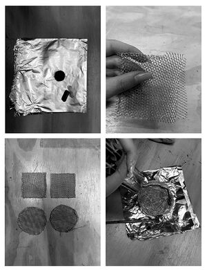
To make the cathodes you need the active coal, epoxy glue, metal nets and electric wires.
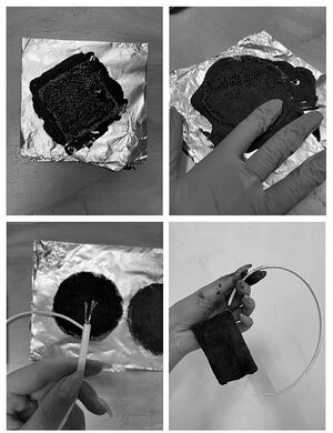
- Empty the pills of the active coal to get the powder out and place it on a sheet (about 10 pills powder per 1 cathode disc).
- Cut two meshes in a rectangular shape, 8 x 8 cm. Place them in opposite directions and fold the edges so they are attached. We make two layers, so it can hold the glue and coal well.
- Brush the glue on the mesh and make sure that you add enough glue and that it is brushed evenly on the surface of the mesh.
- Cover the brushed mesh with the active coal powder and press it very well.
- After pressing, add coal and press again. It is very important that the coal is covering the whole surface.
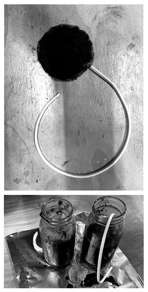
- After making sure that the mesh is covered and pressed with coal, connect the mesh from one of the sides to an electric wire. In the end, you might need to bend the mesh to fit your container. Bend it, but be sure not to make the edges touch each other. More coal surface is better! Now leave it to fully dry.
Preparing first part of the Soil Battery
For this step, you need the container (glass jar), mud, the dried cathodes.
- Put the cathode in the container (make sure that the glue is dry, and the coal is stuck to it).
- Fill the jar with mud so it covers the cathode, keeping the wire out of the container.
- Mark the wire with tape to identify that it's negative. (black = negative)
- Hit the container to get all the trapped air bubbles out. It is VERY IMPORTANT to release the air bubbles from the mud.
Making the proton exchange membrane
(For the steps of preparing and pouring the agar visit:https://github.com/hackersanddesigners/Soilpunk_joulethief)
Connecting the batteries in parallel
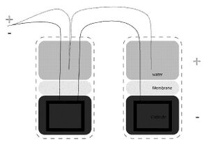
The water part in the battery is (+) and the mud part is (-). When connecting two batteries in parallel, the (-) from the first battery should be connected to the (-) in the second one, and the (+) from the first to the (+) in the second. Then the (-) and (+) should be connected together to close the circuit. See the drawing:
The mud-batteries how-to was assembled in preparation for the H&D Summer Academy 2022 "Connecting Otherwise," and used as a guide during the workshop "SoilPunk" by Hackitects in collaboration with H&D.
Visit https://github.com/hackersanddesigners/Soilpunk joulethief for more complete documentation and
listen to the audio documentation of Radio Echo Collective https://www.mixcloud.com/RadioEchoCollective/hd-connecting-otherwise-soilpunk-with-hackitects-x-hd/
Prototypes for a lighter internet
The project Prototypes for a lighter internet describes a collaborative exploration across the Netherlands and Armenia that resulted in a two week-long workshop for kids and teenagers at The TUMO Center for Creative Technologies[8] in Yerevan – a free-of-charge educational program that puts teens in charge of their own learning.
The aim of the project was to pay attention to the challenges that come with building and participating in contemporary internet culture in a manner that is sustainable and equitable. Data centers, cable networks, and always-on devices (e.g. routers and phones) that allow us to be connected via the Internet have huge energy requirements. Moreover, the mining required to source materials for required chips inside our hardware is exhausting the earth and is the cause for geopolitical tensions. With Prototypes for a lighter internet, we took a hands-on approach to exploring the social and environmental implications of internet technologies from the perspective of those who will be most affected by the rising threats of climate change – kids and youngsters.
Our collaborative mission!
Participants joined the H&D collective for two weeks for an intensive research trajectory and worked together on developing prototypes for a lighter, less wasteful internet. The learning lab was process-driven, giving space for playful trial and error, guided by hacking principles.[9] The question we researched is:
"Why is the internet so heavy?
(And what can we do about it?)"
Through hands-on prototyping we worked our way towards building and imagining a lighter, less wasteful internet, and explored the limits and unexpected possibilities of such a small internet. Along the way, we proposed many exercises to reduce kb, and traced every step of the collaborative research project, documented successful and failed experiments, to share with each other and the world.
Outcomes
We made a series of prototypes for a lighter internet, consisting of:
- Energy-efficient local network for TUMO
- Websites that are programmed with efficiency, accessibility and low bandwidth in mind
- Low-res digital imagery that communicate 'more with less' bytes, that can be used on the web as well as in print
- Collaborative code documentation
The two-week long curriculum broke the question of creating prototypes for a lighter internet into smaller chunks and exercises.
Tooling Days
Participants could choose one of three "tooling tracks" that they could followed for two days at the beginning of the curriculum:
- Small images, compression, low-res graphics
- Accessible and sustainable approaches to HTML, CSS and JS
- Building the required hardware and connecting the toolchain
The skills and knowledge acquired within these tracks were then brought together within group projects.
Miscellaneous Exercises
Field day: mapping the physical internet
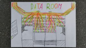
We wanted to draw the participants' attention to the physical presence of the internet in the building within which the workshop took place as well as the neighboring public spaces. This exercise consisted of gathering images, drawings and all forms of data showing where and how the internet reveals itself: WiFi routers, Ethernet cables, man-holes, connected devices, security cameras, rental bikes, WiFi names, etc... After some negotiation and reassuring – and handing in our phones – we also got to take a peek inside the server room.
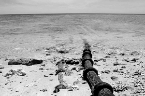
This exercise created an active acknowledgment of the physicality of the internet, grounded the metaphorical cloud in physical hardware devices and brought awareness to things that were not (yet) networked.
Alt-text
We explored Alt-texts, which are detailed image descriptions or [ID], which are a detailed description of images that provide textual access to visual content. Alt-text also refers to the alt attribute in HTML which is a common place to store them.
<img src=”link” alt=”text goes here”>
Exercise: [ID] Swap
Participants chose an image and wrote a detailed image description for it. They then swapped the description with the person sitting across from them, who searched for an image online that resembles the description. In the following, they showed each other the images and discussed similarities and differences, objectivity and subjectivity of writing these descriptions. An interesting aspect about writing image descriptions and alt text is that you can add intention into it. It doesn’t necessarily make sense to go from left to right describing everything in an image because that might lose the central message or create disorientation. How to write a good image description? The object is the main focus. The action describes what is happening, usually what the object is doing. The context describes the surrounding environment.
Exercise: Audio Auditing
As a screen reader describes a website, participants draw the navigation and user flow of the website. This exercise activates an awareness of the too-often neglected software-aided navigation of websites through screen readers. This reverse-engineering of a website's design by listening to a screen reader describing it brings to light the alternative, linear, and tree-like structure scraped out by the browser.
Network observatory
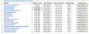
Together we used network inspection, observation and auditing tools to create an incomplete database of our favorite websites and their carbon footprints. We made use of tools for trace routing, carbon-footprint measurement and data-bending to situate our network traffic in geographic, physical and political grounds. Although our database is small and focuses on the carbon offset of one visit to each of the websites, we also propose to see the problem more holistically and from a wider perspective: who is responsible for these emissions, and how could they use these arbitrary numbers like these do to reduce them? What is the responsibility of the individual website visit, and what is missing from these formulas? What if action were taken more collectively?
Throwing: Situated Deployment
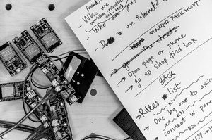
The most challenging part of the workshop as to think together about situations the prototypes could be deployed in. Following their hardware and software limitations of only being reachable within a 25-meter range, they are bound to their contexts in a radius of reach and representation. Although initially perceived as a limitation, it was this locality that informed the projects and their brainstorms.
Prototypes
BusChat
by Diana, Emil, Sergey, Areg, Neron & Vahe
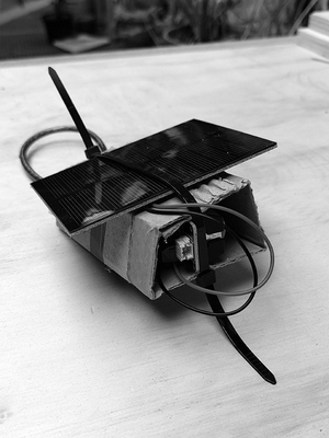
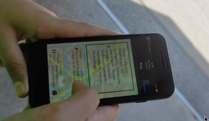
As first-time visitors, we noticed that most bus stops in Yerevan don't provide much information about lines or bus schedules. This is maybe one of the reasons we were offered to get around in cars we could request in an app called Yandex (the Russian equivalent to Uber). With this project, the students wanted to address a need for more information to make use of the public transport system by creating a mobile-first webpage that contains information on the bus routes, stops, and provides a message board to leave relevant updates. The page is specific to the buses operating on the big avenue outside of the TUMO center and would be hosted on a solar-powered module mounted somewhere on or near the bus stop. Students also wanted to offer people some games to play while waiting for the bus, that don't require a dataplan (because you can just log on to the local network to access it).
ParkGame
by Tatev, Liana, Ani, Aram and Miqael
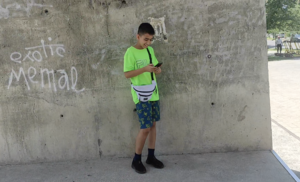
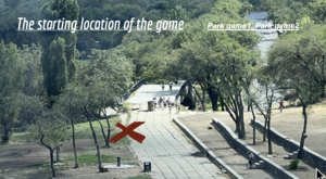
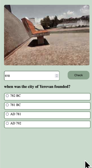
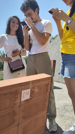
TUMO Center looks out over a huge park with fountains next to the river. This group of students took inspiration from the projects we made in earlier workshops. Their hybrid game tells the story of a traveler who is lost from his tour group. To catch up with them, they have to find key codes hidden in the park and correctly answer questions about Armenia. To complete the game, players have to physically move around the park to find the 13 key codes, and enter them into their mobiles to continue to the 13 quiz questions.
Emergency Service
by Nane, Lilith, Marie, Robert, Harout & Mane
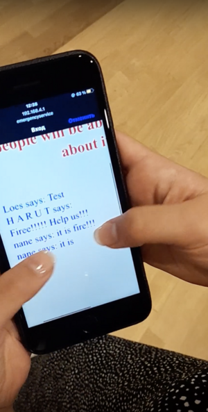
After exploring the physical parts of the Internet, it became clear that this infrastructure is inherently vulnerable and can be damaged. So what would we do if there was an earthquake and our infrastructure stopped working altogether? Where would people get information? How would they contact each other? This local network is designed to provide information and function as a message board where people can leave messages to let others know they need help. The students explained that such a service is extra relevant now, as the region of Artsakh - which has an ethnic Armenian population - is disputed territory and is currently blockaded by Azerbaijan, causing shortages of food, medicine and electricity for the 120,000 residents in the region.
Wiki-to-print, Wiki2print, Wiki-to-pdf, and so on...
An exchange between H&D and Varia about “publishing along the trails”
The design of this bulletin is part of an ongoing collective exploration into unusual, non-proprietary, open-source, free and libre publishing tools. More specifically, we designed this booklet with a web-based tool/workflow that is also referred to as wiki-to-print, wiki2print or wiki-to-pdf. In the following conversation, the two collectives H&D and Varia discuss and trace their experiences of working with wiki-to-print / wiki2print / wiki-to-pdf.
While the prevailing monocultures of design software creates the condition in which it is difficult to imagine publishing processes otherwise, the wiki-to-print experiments discussed here propose other socio-technical scenarios for designing and working together that are not merely utilitarian or solution-driven. Such tools nourish attitudes that resist a linear, efficient, and progress-based understanding of a design process.
(H&D) We are curious about the genealogy of wiki-to-pdf/print as it is used for collective publishing. Can you recollect what brought you to this workflow? What precisely sparked your curiosity and kept you interested in working with the MediaWiki infrastructure to edit and design publications?
(Varia) We were introduced to wikis and the MediaWiki software in particular during our studies, at what is now called the Experimental Publishing Master at the Piet Zwart Institute. The wiki of the course has been used since 2006 and is still used today by the students and staff to document projects, classes and how-to’s, as a shared calendar or place to share thesis drafts with tutors. The sociality of the wiki appears when it is part of the daily infrastructure and when it's used so intensively. The RecentChanges page, for example, has become a place where you can find out what other people have recently been working on. Hooking such social dynamics into a print workflow creates a lot of exciting possibilities when you think about it.
Working with a "fresh" wiki for making a book is quite different, but not less exciting. Using a wiki turns a publishing workflow into a collective environment where everyone can follow the development of the content without imposing predefined article structures. A wiki page is "just" a page. The form and format are open. It's very different from, for example, a WordPress article, where the structure is predefined and cut up into smaller pieces (title, subtitle perhaps, author name, introduction, main text, etc). The attitude of the wiki software, to not impose a structure or format upon you, creates an interesting shift from technical protocols towards social protocols. What we mean by social protocols, is that decisions need to be made together, between people, not through a predefined technical configuration.
This way of making publications is part of a bigger landscape of collective working environments, tools, habits and types of publications. This shift, from assembling a publication using a graphic user interface to compiling a publication through code, is super exciting to us. In our view, the biggest impact this software has, is that it allows for a non-linear way of working: it makes the workflow much more continuous, and the design and editing are done in parallel. Of course, a deadline is unavoidable when working on printed matter. At some point, you need to stop editing. But this deadline is much softer compared to linear workflows where designers need to wait for the final version of the content before the design process can start. You can just make adjustments to the document style in CSS declarations, which are rendered each time you refresh the page. But they don't influence the content, which can keep changing.
Working with wiki software specifically is a small subsection of this landscape. There are many projects that worked with wikis for printed matter. Taking part in such a continuous timeline is super interesting to us! In 2017, Sandra Fauconnier, Cristina Cochior and Juan Gomez worked on the potential of e-books based on Wikimedia content[10]during an INC research project at the PublishingLab. The Wikimedia Foundation has also worked with a range of different tools[11] to add print support to the MediaWiki software and Wikipedia in particular. We had to dig a bit to find that link to PublishingLab, which thanks to the WayBack Machine, still exists online.
This reminds us of the importance of documentation for maintaining links between the trail of wiki printing projects that have been growing in multiple directions in the last years. Code has been reused between different groups, ideas and approaches have been versioned over time, and a range of different kinds of printed publications have been based on wiki workflows: newspapers, printed books, digital PDF files and web pages. This wiki-to-print direction introduces Flask to dynamically connect the writing of the content and the rendering of the PDF. It is a side branch of the longer wiki printing timeline and operates in a more specific art/design context around the Netherlands and Belgium so far, but hopefully, it will continue travelling, morphing and transforming. Some projects on this trail include the following ones, but there are probably more:
- André Castro and Alexia de Visscher's work on Mondotheque with Constant: https://www.mondotheque.be/ https://books.constantvzw.org/home/mondotheque
- OSP's work on DiVersions with Constant: https://diversions.constantvzw.org/ https://books.constantvzw.org/home/diversions-v2
- Manetta Berends' work on Volumetric Regimes with Possible Bodies, published by Open Humanities Press in the * Data Browser series: https://volumetricregimes.xyz/ http://www.data-browser.net/db08.html
- Martino Morandi's work on Wiki-to-pdf with TITiPI: https://titipi.org/wiki/index.php/Wiki-to-pdf https://titipi.org/wiki-to-pdf/pagedjs/Infrastructural_Interactions
- H&D's work on Making Matters: https://hackersanddesigners.nl/s/Publishing/p/Making_Matters._A_Vocabulary_of_Collective_Arts, https://wiki2print.hackersanddesigners.nl/wiki/Publishing:Making_Matters_Lexicon
- Varia's work on Toward a Minor Tech with APRJA: https://darc.au.dk/publications/peer-reviewed-newspaper https://varia.zone/en/toward-a-minor-tech.html https://cc.vvvvvvaria.org/wiki/Wiki-to-print
(Varia) We are curious how you experienced being part of this trail. And how did it feel to see your code being reused again?
(H&D) It took some time before understanding the different pathways of this trail, how code has been forked, continued in different contexts, and developed in different directions. This process is ongoing, constantly evolving, so it's perhaps impossible to fully comprehend. There is a slowness to this process. It seems a (dispersed) collective effort, which is quite interesting. There are no feature requests or an agreement amongst these different groups and repositories about uniform outcomes. These tools can be continuously questioned – conceptually, technically, ethically and not necessarily conclusively ... and readjust the general perception of what is inevitable and what is useful in conceptualizing and actualizing tools. It seems it is a non-linear and somewhat unpredictable trail that has evolved over the years, that has more and less active moments.
H&D has also worked with wikis for a long time already, i.e. as a CMS to our website[12], which is a central place for writing and editing workshop manuals, announcements, workshop and project documentation. André Castro joined a H&D meetup a long time ago (maybe in 2015) and introduced us to some wiki stuff. Similarly to what you describe in the context of XPUB, wikis became an integral part of H&D's collective infrastructure. Wikis are intertwined with the ways the group works together, which is also reflected in the shared excitement about working with wikis as a publishing infrastructure. They allow us to collapse processes of writing, editing, designing, and archiving.
We made a publication in 2015 using wiki and LaTeX [13], and in 2016 we made one using wiki and Scribus [14]
(Varia) What triggered the shift from LaTeX and Scribus to wiki2print?
(H&D) It was exciting to see a layout produced more or less instantly. And it looked pretty good! Yet, the learning curve of LaTeX was quite steep. Being used to somewhat 'intuitive' ways of working with layout software, that is, being able to see different versions of a layout very quickly, the process and outcomes of LaTex seemed rather stiff in comparison. It also seemed that LaTeX is very good at certain things – i.e. making a layout look very 'proper' but not so good at making surprising interventions. The wiki-scribus combination offered more flexibility. We basically used the wiki to edit and structure the publication collaboratively, and eventually used Pandoc to convert the wiki syntax to something we could import to and use in Scribus. We could simultaneously edit in the wiki and easily refresh the Scribus file with the new content without losing the styling we had done. But there was still this annoying break between writing/assembling of the content on the one hand and styling it on the other.
It took us a while to move towards wiki2print. There were various other publishing experiments in between, like heart-beat to print[15], and the iteration of Sarah Garcin's PJ Machine (Publishing Jockey Machine)[16].
What is interesting about wiki2print is indeed the workflow that is so different to what one is used to. As you mentioned before, the separations of different tasks, that are often embodied by different people (designer, writer, coder, copy editor...) are not so separate anymore. As a designer, you make different kinds of choices, you are perhaps more forgiving? It may seem as if less is possible in this workflow, for example in comparison to the inDesign experience. You have less control or agency over the outcome. But one could also question this so-called agency given by certain tools – the illusion of mastery they emanate.
Wendy Hui Kyong Chun wrote about this in her text on Daemonic Interfaces[17]. The so-called intuitive user experience, the dragging and the dropping, moves the tool to the background. One thinks about it less if one feels "in control". You don't question it anymore, it enters your subconscious... In this way, tools like inDesign, become unquestionable, unchallenged. Working with wiki2print is quite edgy in comparison. The limits are very present... maybe something to hold on to, not to overcome?
In 2022, we worked on the Making Matters publication [18] for which we looked at the repository of Manetta for Volumetric Regimes for Possible Bodies[19] and Martino for TITiPI[20]. It was super helpful to see some exciting examples and build upon what is already there. By doing so, also a feeling of response-ability evolved, to make the trail legible somehow. The writing of the colophon became an important part of making that trail more visible. We added an elaborate Note about the design of the publication in which we acknowledged the work that has already been done, and mentioned other relevant projects and practices that inspire us. We felt so excited to read the colophon of Minor Tech and see the trail grow.
As you mentioned before, part of continuing the trail is also making sure projects are well documented so that someone else can understand and reuse them. We also like the idea of contributing to the larger collective effort to improve these forms of publishing. For instance, we heard about a small issue, that we felt we could pay attention to in our next publication (First, then... repeat).[21] Wiki has a very useful feature for uploading new versions of files. Yet, in the Paged.js preview, the new file versions were not updating. In Making Matters, we found a convoluted workaround by renaming every new file version and changing the image tag in the article. We now added an "overwrite images" check box[22] which replaces the image with the last uploaded version.
(Varia) Super nice to see that feature! Maybe related to the new image versions issue... We also ran into the issue that MediaWiki works with a job queue, which means that edits are held back and spread over time to make sure that the server is not overloaded. We are working around this by running the `runJobs.php` maintenance script that is shipped with the MediaWiki software, which works, but it is still a bit of a stretch.
Speaking of features, it is nice to see custom Paged.js features appearing in other projects. Amélie Dumont is currently working on a website and book for which they work with a Javascript function to "keep" your scroll after a refresh. This is such a super useful feature when working on a book with many pages!
It is nice to be reminded of the https://wiki2print.hackersanddesigners.nl/ link btw and to see the index page that you and also Martino started to work with. We decided to step away from it and integrated the index and update button(s) inside the wiki. There are two update buttons in our case: one for the text and one for the heavier updates of media. In that way, we don't need to switch between the wiki interface and the Flask one, which felt like an interesting step towards staying within one shared environment both for writing and layout making.
(H&D) It seems we have developed ways of working on publications that are quite flexible and sometimes come with surprising outcomes. What is enjoyable about this way of working is that content production and design of publications can emerge on the go and in response to different collective conditions (i.e. different timelines, dispersed geographies, janky infrastructure). In the context of the Making Matters publication, this somewhat unforeseeable collective process that we usually cherish, became quite challenging and somewhat incompatible with the material realities and ways of working of a publisher. You mentioned the softness of boundaries between designing, writing and editing. These soft boundaries can also become a bit scary when working on a publication with many pages, many contributors, large editions, involving high production costs.
There are many more tensions that can be experienced when it comes to designing for print in the browser. For instance, preparing and uploading images in high resolution seems counter intuitive in the context of web and network technologies. What are other tensions that come to mind, and how do you negotiate those? Do you know of printing techniques that can be regarded as more compatible with wiki-to-print workflows than others?
(Varia) Editing wiki pages in order to change how a page will look on paper feels very counter-intuitive, as well. And sometimes you forget about things that are elementary to the web, like animated GIFs. In the browser, of course, you can use animated GIFs. However, before exporting PDFs we had to remove the GIFs from wiki pages, to have control over which frame would appear in print. Of course you can undo these edits after exporting and still have the GIFs on the wiki, but it still feels counter-intuitive.
Another important bottleneck in the wiki-to-print workflow is image placement. When we approach a page as a "canvas": with fixed margins, columns and font size, the positioning of images is a very painful part of the process. The placement of an image depends on its position in the flow of the text. But of course, when you place an image on a wiki page, you have no idea where it ends up on a printed page! CSS Regions was initially introduced to work around this as it allows you to position the images and let text flow around them on a page. But unfortunately, CSS Regions are not supported anymore by current browsers. Designing for print requires a different attitude than for web. To give every image the same fixed width seems quite brutal in print, even though it may be desirable on the web, or vice versa. But the effects of resizing images one-by-one can easily cascade, and you have to think about what else is affected on following pages.
Shifting away from tools that are based on 500+ years of book design traditions toward web environments that are based on network technologies has many implications. One thing we noticed is that there has to be an adjustment in how much time and attention is given to producing a PDF for print. The instantaneousness of the web affects understandings of how ready the PDF is for printing, or how PDF documents are built at all. The PDF may still need to be converted into CMYK colorspace, distilled for a particular PDF format or have imposition applied before it is sent to a printer. Even though you can see it rendered in a browser window immediately, the print preview is a sort of illusion. You are not really looking at the final version of the PDF at all. A lot of steps need to be taken afterward to match industrial printing standards.
(H&D) What processes do your PDFs undergo 'afterward' to match printing standards?
(Varia) The Volumetric Regimes book is produced on-demand and needed to be submitted in a PDF/X-3:2002 format, which is not the format that browsers provide by default. It was quite a search to find a way to turn a PDF into that format, and in the end, LaTeX was the way out here. Another big surprise that appeared during the making of the Volumetric Regimes book was the disappearance of the emoji face on the cover.[23] We wanted to overprint this black emoji on the blue background gradient, which we managed to do with Ghostscript and OSP's PDF-utils repository.[24] The PDF looked fine, the preflight software displayed the cover fine, so we were relieved! What we did not expect though, is to receive a box of books without the author names. They disappeared! The overprinting feature was applied to all elements on the cover, including the white text. Thanks to the help of the OSPs, we figured out that we could use Scribus to open the cover PDF and apply overprint only to a particular layer of the PDF. It was such a struggle!
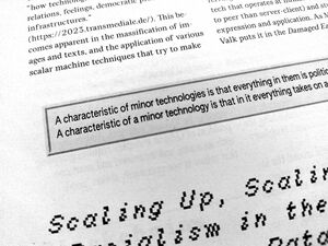
The Minor Tech newspaper didn't require such a conversion, because we could talk with the people at Tripiti directly, who printed the newspaper for us. In that case, we only converted the PDF into a grayscale colorspace, to make sure that the whole PDF was rendered in one color, which we needed because the newspaper was printed in offset with a spot colour.
One important thing to keep in mind is browser choice. We used Mozilla Firefox for the Minor Tech newspaper up until realizing (just after midnight) that images were all in very low resolution when we pressed ctrl+P. So we had to switch to Chrome to make the final PDF. Even then, Chrome rendered the PDF slightly differently, and we had to make some adjustments. These are things you hardly think about until right at the end of a design process. Luckily, we caught this in time!
(H&D) We loved reading your article about disappearing / eaten sentences: https://cc.vvvvvvaria.org/wiki/Octolog) and the hacks people invent to work around these issues,
<br/><br/><br/><br/><br/><br/><br/>
:-)))
Karl brought back the Minor Tech newspaper from Transmediale. We were particularly impressed by the column layout! We have experienced a lot of issues with disappearing text in columns in the (printed) First, Then... Repeat publication.[25] We felt a bit haunted by it and had agreed to NEVER use columns again! As you have experienced too, text kept disappearing in the pdf, while in the browser it would still be visible!
(Varia) Yes, the disappearing sentences, oof, they were so painful. What really helped was that we were able to reach out to Paged.js through their Mattermost chat. Julien Taquet works on Paged.js and is super present on the chat. It was through him that we could start to understand the cause of this issue. It was very helpful and partially released some stress. But it did not solve the issue straight away, as it is a very sensitive one with close ties to the lower processing levels of Paged.js. So in the end we forced a page break on a very specific position in the text, which is a very scary thing to do, because it means that nothing else in the article can be changed anymore, not even a letter, to make sure that you don't end up with big gaps in the text.
(Varia) To come back to other tensions related to collective processes, what challenges did you encounter during the Making Matters production? What kind of changes were made at the last moment? How did this have an impact on the layout?
(H&D) A challenging element was to converge the expectations of making something that reflects collective experimentation, which the book spoke about in its content and on the other hand negotiate the pretty much non-negotiable linear workflow of academic publishing, very tight deadlines, and many contributors and editors involved that didn't know each other well, were dispersed and hard to reach. A more fluent reciprocal process in this context didn't seem feasible. The notions of "experimentation" as well as "collective" were taken for granted as something inherently productive, as something that leads with certainty towards results – that can be predicated and measured by the same standards and criteria as any other book. While we were open about being interested in challenging the arbitrariness of what is considered professional book design, there were moments in which our "expertise" as designers was being questioned.
By choosing this path, we had implicitly decided that micro-typography may not be our biggest priority. Instead, we could pay attention to other exciting things. For instance, the publication accommodates non-linear reading, which is something that the flat structure of a wiki inspired us to work with. Cross-references are indicated with different kinds of arrows, referring to one of the seven chapter themes. The arrows occur on the chapter introduction pages, next to the respective terms, as well as in the side-bar navigation of the respective chapter categories. This allows the reader to quickly sift through the book and find related contributions in different chapters. In addition, elements in the side-bar navigation subtly poke out when indicating the occurrence of a key term in the text. We also worked with different colors per chapter and a subtle gradient that changes throughout the whole book to indicate that terms do not 'belong' solely in one place, but that their place is ambiguous and contextual and their meanings can spill over into other chapters. The latter caused quite some pain in the pre-press process. The generated PDF had so many strange hidden elements and layers in it, that apparently showed up in the pre-press software and caused a lot of troubles producing the gradient. We were not in contact with the printer directly, which made this whole pre-press struggle even harder.
Making Matters was our first wiki-to-print attempt. Entering a rather large project with a publishing infrastructure that was quite new to us was exciting at first, but also quite risky and stressful as there were so many moving variables.
We had to present a pretty fixed design proposal at the beginning of the process, which we then worked towards. In a way, we made a promise without knowing what was possible. On the one hand, it was helpful to have a goal – something to hold on to. But it was also stressful because of unexpected quirks and impossibilities. Honestly, we also worked on it in this way because there was a budget, which gave us the possibility to finally dive into this workflow. Eventually, we worked at least double of what we were paid though. Haha.
After that publication, we've been moving more and more towards a CSS editing process in the wiki CSS panel. That way, editing and styling become part of the same workflow, which also facilitates a more flexible approach to the design of a publication.
(Varia) How did you do it before having the CSS in the wiki CSS panel? It seems to have had a big shift to work within the wiki all together.
(H&D) The Making Matters book needed to be laid out on a baseline grid, which proved to be challenging in CSS. We used a more traditional web development approach for the styling using Sass and a library called Plumber that made it possible to have a baseline grid in CSS. Web fonts don't always have a consistent baseline, so you need to account for that, for each font using positive and negative margins. Also images needed to be scaled so that they conform to the grid vertically. Headaches! This meant that editing content and applying styles were not integrated into a unified workflow, regrettably. On the other hand, since the project was so CSS heavy, it made sense to work on it in a more 'user-friendly' environment. There were so many small interventions! As mentioned before, the book is structured like a dictionary and each time there is a keyword in the text the illustration in the margin reacts to that, creating a little animation when you flip through the book. We used p5.js with a SVG renderer for that so that the illustrations were usable in print. In the end, we made a little front-end in the PDF view where we can play with some of the settings, change the version of the script, toggle a view of the baseline grid, and separate layers for printing. It was a fun challenge, but since then we have moved more and more towards a single workflow, and also simpler layouts.
(H&D) We are curious, how do you organize collective workflows around a wiki-to-print project? i.e. How many people are involved in the workflow? How are tasks divided? Are you working in the same space or distributed/remotely? What are appropriate timelines and budgets?
(Varia) We noticed that working closely between editors and designers is really needed to make it happen. It is also important to have a shared understanding of the limitations and possibilities of wiki software, to find ways to think along with the workflow instead of going against the grain. This needs time for conversation, and reflection and it is always a bit of a struggle. It's something that we are still figuring out.
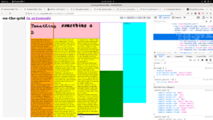
We have different experiences regarding the columns and collective conditions shaped by the workflow that also depend on the publication's content, conditions, collectivity and design choices. With Varia's occasional printed newsletter SomeTimes we were used to using columns in Octomode (a way of making PDFs from Etherpads), where all you have to worry about usually is how content flows from one column to another. To give an idea, this is the PDF of SomeTimes, Issue 1, made in Octomode:
https://varia.zone/documents/SomeTimes_number-1.pdf
The content of SomeTimes is made collectively from RSS feeds, particular hashtags on Mastodon, and posts gathered by a logbot. We have made a couple of issues by now. The simple design works. We don't need to change it much. The budget is low, we produce it on A3 on a laser printer in our space in Rotterdam. Also, the timelines are always short because we're always already in the middle of many other projects while working on it. In the making of this RSS workflow, we took these limitations as starting points for the design and development process.
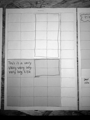
On the other hand, the Minor Tech newspaper was made using wiki-to-print and CSS grid during a two-day publication sprint between two people in Rotterdam and a large group that was writing and editing articles at a workshop in London. We were new to using CSS grid for paged media, and it took quite some tetris-ing to work within the constraints of the grid and a pre-determined page count. We spent a few hours before the sprint puzzling how different articles could fit, sketching in Octomode and on paper.
From the beginning, we had to accept the constraints of working within a rigid grid, where it is impossible to flow articles from one page to another. It worked out in the case of the Minor Tech newspaper, as the texts were written with a maximum amount of 500 words. We ended up with a lot of small empty spaces though. We asked the writers for "cellular contributions" – content that would fit within the spaces of the newspaper that were left empty after our tetris-ing. The proposal for cellular contributions resulted in super nice quotes, pictures, and cute advertisements.
In this way, the shortcomings of working towards particular formats and scenarios, such as the typically heavy content density of a newspaper or a two-day collective production sprint, became a springboard into more experimental solutions and gave flexibility to the content and layout. This came from our choice to use CSS grid and also the availability of our collaborators during this sprint. But each publication workflow varies and calls for different approaches. The use of CSS grid had a nice side effect, but the remote way of working during the sprint did not really help to let the production of content and layout overlap and intertwine. We would do this differently next time and prioritize being together in the same space to make sure we are in conversation with each other.
... This conversation will be continued in one of the next bulletins.
A Note on the design of this publication
Hackers & Designers’ publishing experiments intersect computer programming, art, and design, and involve the building of self-made, hacked, and reappropriated tools and technical infrastructures, which sometimes results in printed output, such as the one you are holding now.
Following open-source principles, the tool ecosystem that evolved around the design of this publication is documented and published on the H&D website[26] and git repository [27] under the CC4r license,[28] providing the possibility of continuation in other contexts, studying, critiquing, and repurposing.
We hope these small publications contribute to a growing community of designers who consider it relevant to rethink their tool-ecologies and building forth on the knowledge and practices of many designers and collectives that work with and contribute to open-source approaches to designing on and offline publications.[29]
Publishing the H&D bulletins is furthermore an attempt to research small printing presses, more specifically how experimental, open source, DIY publishing tools (often made by repurposing web technologies) and the at times, janky pdfs they produce, intersect with material realities of pre-press processes and different eco-conscious printing techniques.
The tool ecosystem includes: MediaWiki, Jinja templating, Pagedjs for the layout.
On accessibility
For this bulletin, we used syllable-based highlighting to create a dyslexia-friendly reading experience. This method provides visual cues that break down words into manageable syllables, assisting individuals with dyslexia in word recognition and segmentation. By doing this, we hope to improve accessibility, enhance the reading experience, and promote better comprehension for readers with dyslexia. To strike a balance between accuracy and efficiency, we implemented a heuristic method for syllable detection. The algorithm approximates the position of syllable boundaries by leveraging patterns of vowels and consonants. While it may not be perfect, we hope that this approach is effective enough of our use case.
Colophon
Contributors: Loes Bogers, Lukas Engelhardt, Anja Groten, Hackitects (Michel Barchini, Mary Farwy), Heerko van der Kooij, Juliette Lizotte, Karl Moubarak, slvi.e, Sheona Turnbull and Varia (Manetta Berends, Simon Browne)
Editors: Anja Groten, slvi.e
Design: H&D (Anja Groten, Heerko van der Kooij)
Typefaces: Authentic, NotCourier
Printing: Stencilzolder, Amsterdam
Publisher: Hackers & Designers, NDSM-plein 1033 WC, Amsterdam, www.hackersanddesigners.nl
With the kind support of Stimuleringsfonds Creatieve Industrie
License
COLLECTIVE CONDITIONS FOR RE-USE (CC4r)
Hackers & Designers, 2022.
Copyleft with a difference: This is a collective work, you are invited to copy, distribute, and modify it under the terms of the CC4r gitlab.constantvzw.org/unbound/cc4r.
REMINDER TO CURRENT AND FUTURE AUTHORS:
The authored work released under the CC4r was never yours to begin with. The CC4r considers authorship to be part of a collective cultural effort and rejects authorship as ownership derived from individual genius. This means to recognize that it is situated in social and historical conditions and that there may be reasons to refrain from release and re-use.
Copyleft Attitude with a difference, 24 November 2022.
The CC4r was developed for the Constant work session Unbound libraries (spring 2020) and followed from discussions during and contributions to the study day Authors of the future (Fall 2019). It is based on the Free Art License http://artlibre.org/licence/lal/en/ and inspired by other licensing projects such as The (Cooperative) Non-Violent Public License https://thufie.lain.haus/NPL.html and the Decolonial Media license https://freeculture.org/About/license.
The H&D Bulletin is a quasi-quarterly publication culminating a mix of practical and reflective articles, conversations, scripts and manuals, experimental, poetic, visual or otherwise speculative contributions from H&D coop members, invited guests, participants of our activities and critical friends. It is published on the H&D website, the mailing list, and distributed via our social media channels. Printed versions are distributed through the H&D network whenever there is an occasion. This edition of the H&D bulletin was assembled and published using a wiki-to-pdf workflow.
- ↑ Lauren Berlant, “The commons: Infrastructures for troubling times,” Environment and Planning D: Society and Space 34, no. 3 (2016): 393–419.
- ↑ Karen Barad, "Meeting the Universe Halfway: Quantum Physics and the Entanglement of Matter and Meaning." Durham and London: Duke University Press. (2007).
- ↑ Johnson, "G. Kareola “Solarpunk & Web3” https://zine.zora.co/solarpunk-web3-kareola, in: Solarpunk & the Pedagogical Value of Utopia" (2020).
- ↑ G. Kareola “Solarpunk & Web3” https://zine.zora.co/solarpunk-web3-kareola, in: R. Williams, ‘This Shining Confluence of Magic and Technology’: Solarpunk, Energy Imaginaries, and the Infrastructures of Solarity”, Open Library of Humanities, 2019.
- ↑ https://hackersanddesigners.nl/s/Events/p/Solarpunk_Kids_%28Bring_Your_Own_Grown-up%29_%E2%80%93_Scavenger_hunt_in_and_around_Page_Not_Found.
- ↑ G. Kareola “Solarpunk & Web3” https://zine.zora.co/solarpunk-web3-kareola, in: Sultana, F. (2022) Critical climate justice. The Geographical Journal, 188, 118–124.
- ↑ https://wiki.xxiivv.com/site/permacomputing.html.
- ↑ https://tumo.org/
- ↑ We refer to hacking as the curious and joyful act of opening up technology, and using it in novel, unexpected ways.
- ↑
https://web.archive.org/web/20171016013843/
http://www.publishinglab.nl/wiki-ebook/2017/01/27
/wrapping-up-the-wiki-research/ - ↑ https://www.mediawiki.org/wiki/PDF_export
- ↑ https://hackersanddesigners.nl/s/Publishing/p/The_making_
of_hackersanddesigners.nl - ↑ https://hackersanddesigners.nl/s/Publishing/p/HDSA2015-documentation
- ↑ https://hackersanddesigners.nl/s/Publishing/p/HDSA2016-documentation
- ↑ https://hackersanddesigners.nl/s/Publishing/p/Heartbeat-to-print
- ↑ https://hackersanddesigners.nl/s/Publishing/p/On_%26_Off_
the_Grid_Publication - ↑ Chun, Wendy Hui Kyong, Programmed Visions: Software and Memory (Cambridge, MA, 2011; online edn, MIT Press Scholarship Online, 22 Aug. 2013),
- ↑ https://hackersanddesigners.nl/s/Publishing/p/Making_Matters._A_Vocabulary_of_Collective_Arts
- ↑ https://volumetricregimes.xyz/ http://www.data-browser.net/db08.html
- ↑ TITiPI: https://titipi.org/wiki/index.php/Wiki-to-pdf https://titipi.org/wiki-to-pdf/pagedjs/Infrastructural_Interactions
- ↑ https://hackersanddesigners.nl/s/Publishing/p/First
%2C_Then..._Repeat._Workshop_Scripts_in_Practice
- ↑ https://wiki2print.hackersanddesigners.nl/
- ↑ https://volumetricregimes.xyz/index.php?title=File:VRcover.png
- ↑ https://gitlab.constantvzw.org/osp/tools.pdfutils
- ↑ https://hackersanddesigners.nl/s/Publishing/p/
First%2C_Then..._Repeat._Workshop_Scripts_in_Practice
- ↑ hackersanddesigners.nl/s/Tools.
- ↑ github.com/hackersanddesigners.
- ↑ constantvzw.org/wefts/cc4r.en.html.
- ↑ Collectives that inspire us in our design experiments are Varia, Constant Association for Art and Media, Open Source Publishing, the practices and knowledge deriving from educational contexts such as the student-led interdepartmental initiative PUB at the Sandberg Instituut Amsterdam or XPUB—a master programme of xExperimental Publishing at Piet Zwart Institute, the digital and hybrid publishing research groups of the Institute of Network Cultures. Concretely, the technical infrastructure and workflow used to create this publication (wiki-to-pdf) is building on the code repositories of Martino Morandi (Constant Association for Art and Media) developed for the publication ‘Infrastructural Interactions’ edited by TITiPI (Helen V Pritchard, Femke Snelting) (gitlab.constantvzw.org/titipi/wiki-to-pdf), and Manetta Berends (Varia Collective) developed for the publication Volumetric Regimes edited by Possible Bodies (Jara Rocha, Femke Snelting), published under the CC4r license (git.vvvvvvaria.org/mb/volumetric-regimes-book).
